The media plan is the central place where all placements, budgets, and formats of a campaign are managed.
Note: Depending on the user role and permissions, some menu items or functional areas in the view may differ.
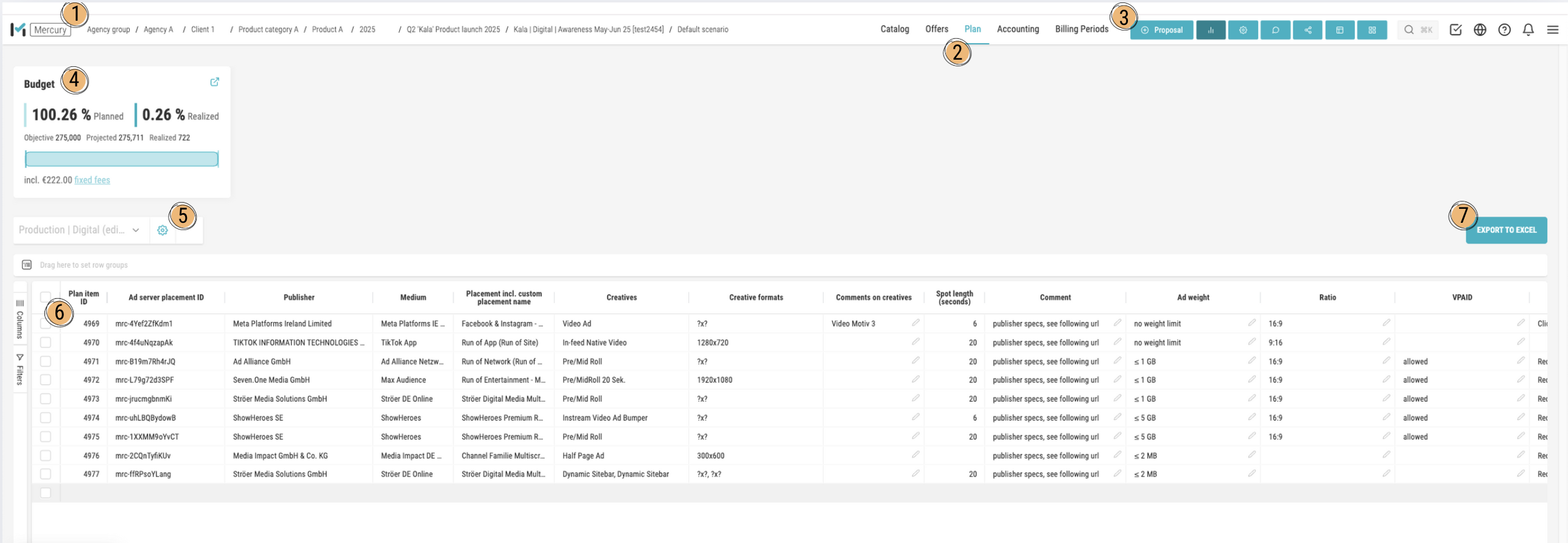
1. Breadcrumb Navigation
The breadcrumb bar at the top shows which level you are currently on. You can use it to quickly navigate back to the main category or to subsections. This helps you always keep track of your current path in Mercury.
2. Tabs and Active Section
The tabs at the top (e.g., Catalog, Offers, Planning, Billing) indicate which module you are currently in. The active tab is visually highlighted — in the shown example, it is Planning. Here you work with the plan lines that were previously taken from the Offers tab.
3. Create a New Proposal or Plan item
Use this button to create a new offer or new plan line. After saving, you are automatically redirected to the Offers tab. From there, you can manually transfer the newly created plan line into the planning section to edit it within the media plan.
4. Budget Overview
In the budget overview, you can see your planned and actual budgets side by side. In addition, target and forecast values are displayed. The progress bar below visualizes the current implementation status of your campaign.
5. Views & Column Control
Here you can save and select views. Depending on the chosen view, different columns are displayed in the table. Using the gear icon you can:
- add or hide new columns,
- adjust the sorting,
- and change the order of the columns.
This allows you to customize the media plan to fit your personal workflow.
6. Plan item Table
The table lists all plan items of your campaign. Each line contains key information such as publisher, media outlet, placement details, ad formats, and spot lengths. Using the left sidebar, you can show or hide columns and apply filters.
Table Functions
The following points (7–13) describe the advanced interaction options within the table view. They show how to adjust, group, pin, or filter columns to make your planning process more efficient.
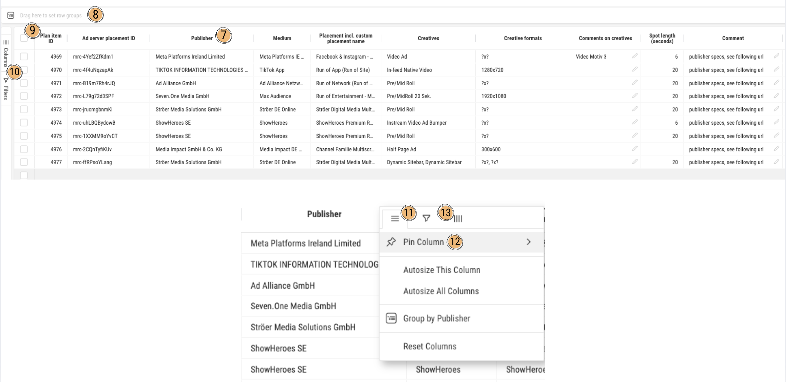
7 – Column Header
You can move the column via drag and drop by clicking on the column header and dragging it to another position. A simple click on the column header changes the sorting order of the table (ascending or descending).
8 – Group Columns
You can drag one or more columns to the upper area via drag and drop to group the table by those columns. Example: If you drag “Publisher” here, all rows will be displayed grouped by publisher.
9 – Checkbox (Row Selection)
The checkbox at the top allows you to select all plan lines at once. If you click on a single checkbox in a row, only that specific plan line is selected — or multiple ones if you manually check them.
Pro Tip: If you simply click inside a cell and then press the spacebar, that row will also be selected.
10 – Column Manager & Filter Manager
Click the “Columns” button to open the Column Manager. There you can see which columns are currently visible, search for additional columns to add or remove. With the Filter Manager, you can also set filters to display only specific rows or columns.
11 – Column Menu (Burger)
This icon opens the Advanced Column Menu. Here you can find functions such as:
- Pin Column
- Adjust columns to text size
- Reset Columns (restore default settings)
- Group by column
- Apply filters
- Show or hide columns
12 – Pin Column
This feature allows you to pin a column so that it remains visible while horizontally scrolling. You can pin it either to the left or right side to keep important columns like “Plan Line ID” or “Publisher” always in view.
Pro Tip: If you drag and drop the column header all the way to the left or right side of the table, you can also pin the column this way.
13 – Filter and Column Selection
Here you can, similar to point 10, select or deselect columns and set filters accordingly.